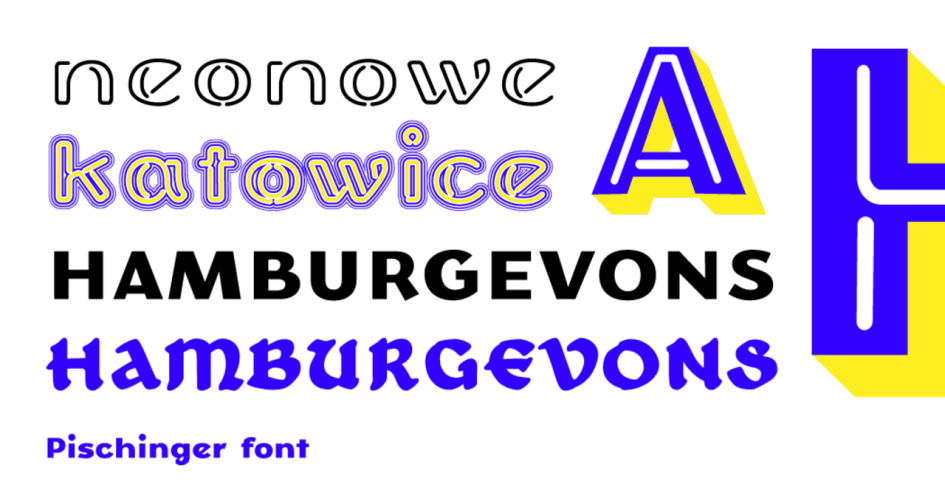
Pischinger is a multi-layer font drawing on Katowice’s history and iconography. It was created as part of Katowice Typographic Research, a project conducted by typeface designer Verena Gerlach.
The contemporary appearance of Katowice’s streets is the result of complicated history and mutually conflicting styles and conventions. From the gaudy language of modern advertising, through the handmade signs of shops and workshops, neon signs still preserved in some places, to even earlier Art Nouveau influences.
The typeface creators found much inspiration in documents concerning the region where clear German influences were identified. For instance, while the propaganda posters relating to the plebiscites held in Silesia, show a clear antagonism between the two countries, reflected also in the graphical language used, the calligraphic tradition is rich in striking mergers – a result of drawing from many styles and conventions.
Pischinger’s multi-layer structure, in which each successive layer expresses the nature of a different period in the city’s history, clearly reflects these correlations. The these combinations sometimes enhance readability and sometimes undermine it, illustrating the current typographic condition of the city.
The font two basic varieties: Fraktur and Grotesque (sans serif Antiqua). It also contains many variants drawing from, among others, neon signs, vinyl three-dimensional letters and vernacular typography. The individual layers are inspired by different periods in Katowice’s typographic history. While the German times are reflected by Fraktur, the neon sign lettering is a reminiscence of the 60s and 70s, and the vinyl and three-dimensional typography are a symbol of the transition period and conversion to capitalism in the late 1980s. All varieties can be freely mixed by putting them on top of each other and creating new configurations.
Thanks to its friendly appeal, Pischinger can be used in visual identity projects to promote the city as well as in promotional merchandise. Users are free to install it on their own computers and use it to enhance their own design projects.